Pick And Drop : Ride Sharing Made Easy

Introduction

Pick and Drop is a mobile application that aims to provide an easy and efficient way of picking up and dropping off friends while driving to/from a common event. Using the application, users can mention details about a shared-ride such as how many pick-ups are scheduled, the locations of the scheduled pick-ups, the names of the people involved in the ride and the final destination. The application then provides an optimized route that starts from the home location, goes through all the pick-up points and ends at the final destination. What’s more is, all the people scheduled to be picked up get real time updates on the location of the car so that they are not left wondering. Moreover, every rider can further suggest changes to the route being followed while picking them up, and the same information reaches the driver in real-time. A similar routine is followed while dropping off people at their desired locations.

Context

In an urban setting like the city of Atlanta, people almost always need cars to commute from one place to another. Those who either do not have private cars or do not want to use their cars (for e.g. while going out clubbing), often tend to use services like uber or lyft, or share a car with friends.


Uber or Lyft

These services connect car drivers to people in need for a ride. However quite often it is seen that a “Uber” or a “Lyft” car is used in a fashion akin to carpooling- one person calls the car, then picks up a few friends from different places before going to the final destination. A similar behaviour is also noticed on the return journey- one person from a group books a car, the entire group of people takes the ride and then each is dropped off at different locations in the city before reaching the final drop-off point. The recently added “Split fare” feature in the Uber app and the numerous discussions in online forums like “reddit” about how to enter multiple destinations on the Uber App, gives proof of aforementioned behavioral trend.

Sharing a Ride with Friends

People like to attend events with friends. In such a situation it is often observed that one person with a car agrees to pick up several others (3-5 people depending on the size of the car) while driving to the event location. This not only makes the ride much more fun but also turns out profitable in terms of fuel expenditure. This also means lesser number of cars on the road and much lesser parking issues.

Users

Users of the Pick and Drop app will typically have the following characteristics
  • Urban dwellers: people who tend to use private cars to travel in and around their cities.
  • Mostly belonging to 19-34 age group, who communicate with friends using various apps

Design Implications

  • Interface design has to be modern and advanced to attract the target user group
  • Design must support interaction on the go in a secure manner
  • Users should be made aware of the state of the system throughout the interaction period
  • Users are well aware of existing technology. Hence, the system must be robust and provide enough flexibility to users, to handle various kinds of unplanned situations.
  • Users will like to have the power of over-riding machine generated decisions.
  • Steps of interaction must be minimized

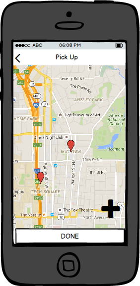
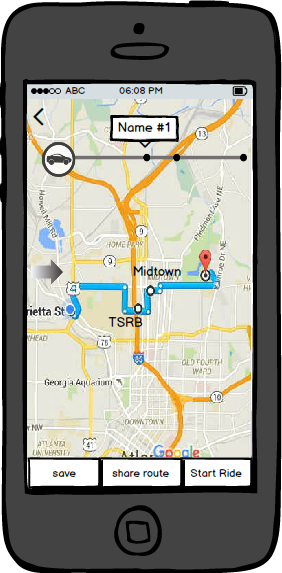
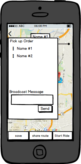
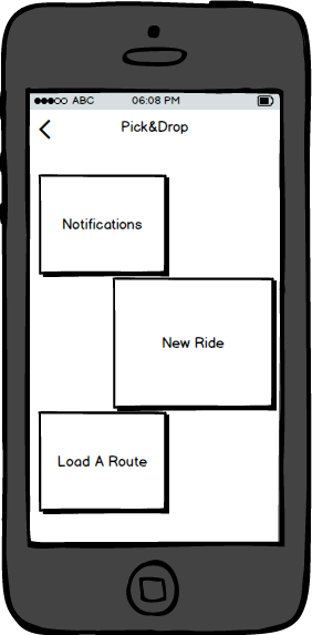
Wireframes in Balsamiq


Design Highlights

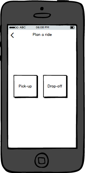
  • Predictable interaction: Button actions and button labels are intuitively mapped to avoid confusion.
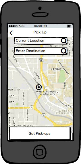
  • The task of entering addresses is achieved in a similar way as that in “Google Maps” application.
  • Consistency is maintained in the layout of the application. Every screen has a header to inform the user about the current page and about the implication of the last action.
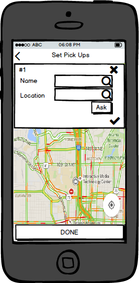
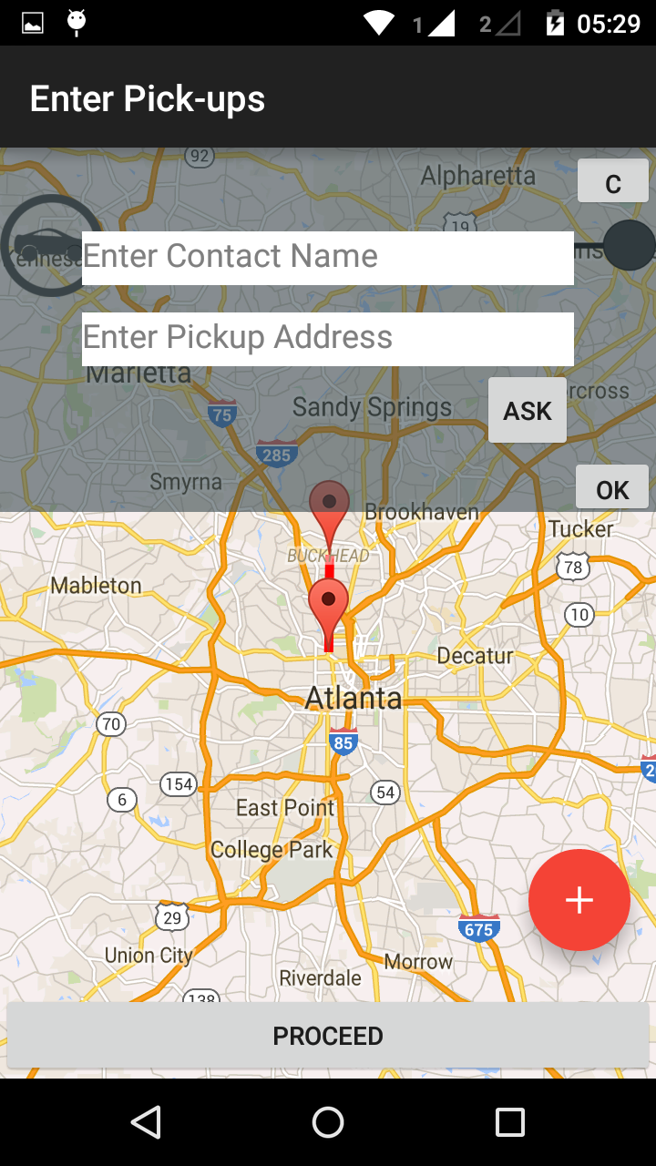
  • Task migratability is achieved by allowing the user to decide who gets to enter the pick-up locations. Using the “ask” button as shown in Fig 1d and Fig 1g, a user can ask the person being picked up, to enter his/her own address.
  • Customizable interaction: Once the route is generated and shared, those being picked up can drag and change the route to their locations and the driver will be notified of the change in route. This feature is introduced to better use each person’s specialized knowledge about his/her locality.
  • Substitutivity: There are multiple ways of achieving a task. For example, a simple task of entering a name can be done by either typing in the name or searching through contacts. Notifications can be sent automatically by the system. But users can also communicate by using the “broadcast message” option.
  • Observability: The “Share Route” feature creates a shared map resource which can be suitably edited by every participant and every change gets reflected throughout.

High Fidelity Prototype

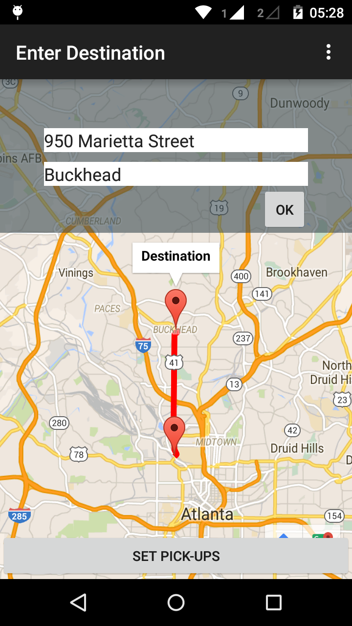
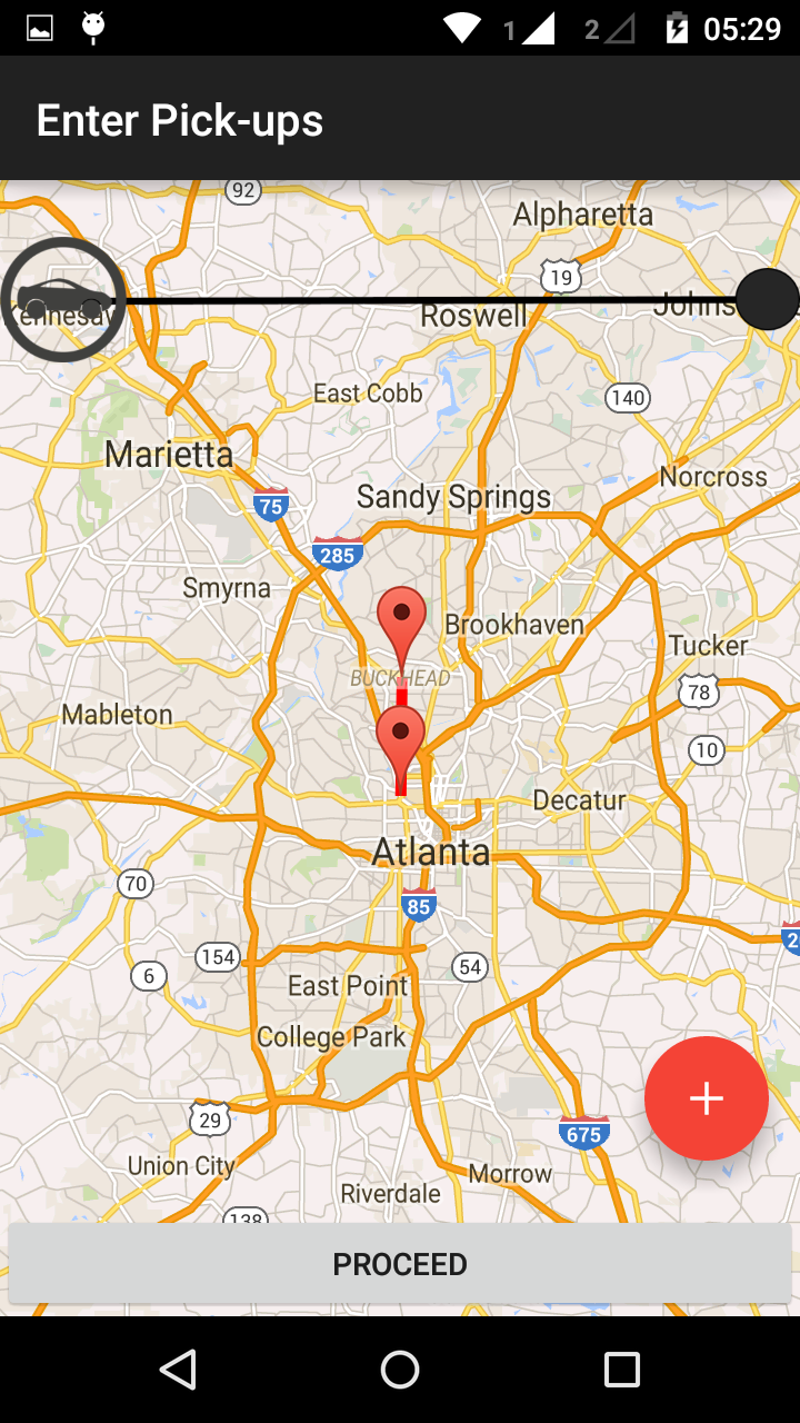
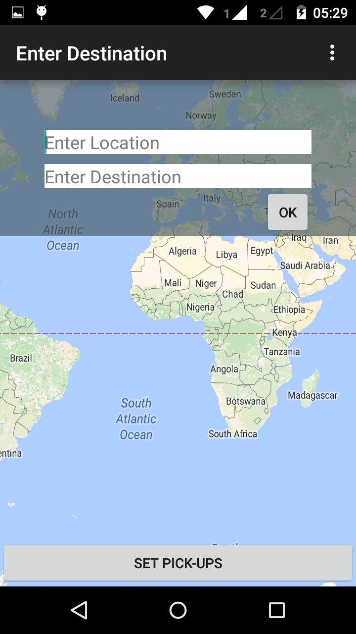
The first prototype has been built in android (native development) to implement the basic functionality of being able to schedule pick-ups and associating names with their locations. Android Studio is ideally not the best tool to implement the first prototype, however this served as an useful app development exercise for me and hence I went ahead with it. The prototype supports the following currently :
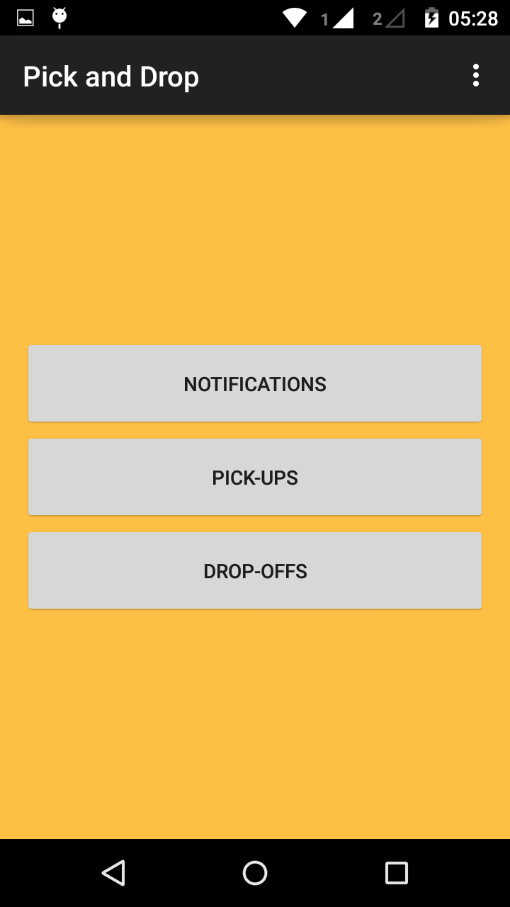
  • Choose between dropping off or picking up someone
  • Set a source and a destination for the trip
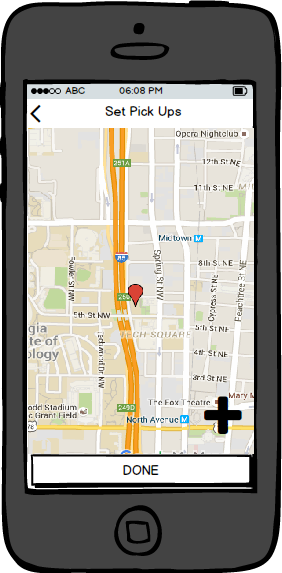
  • Enter pick up/ drop-off points so that a composite route can be generated that goes through all the way-points
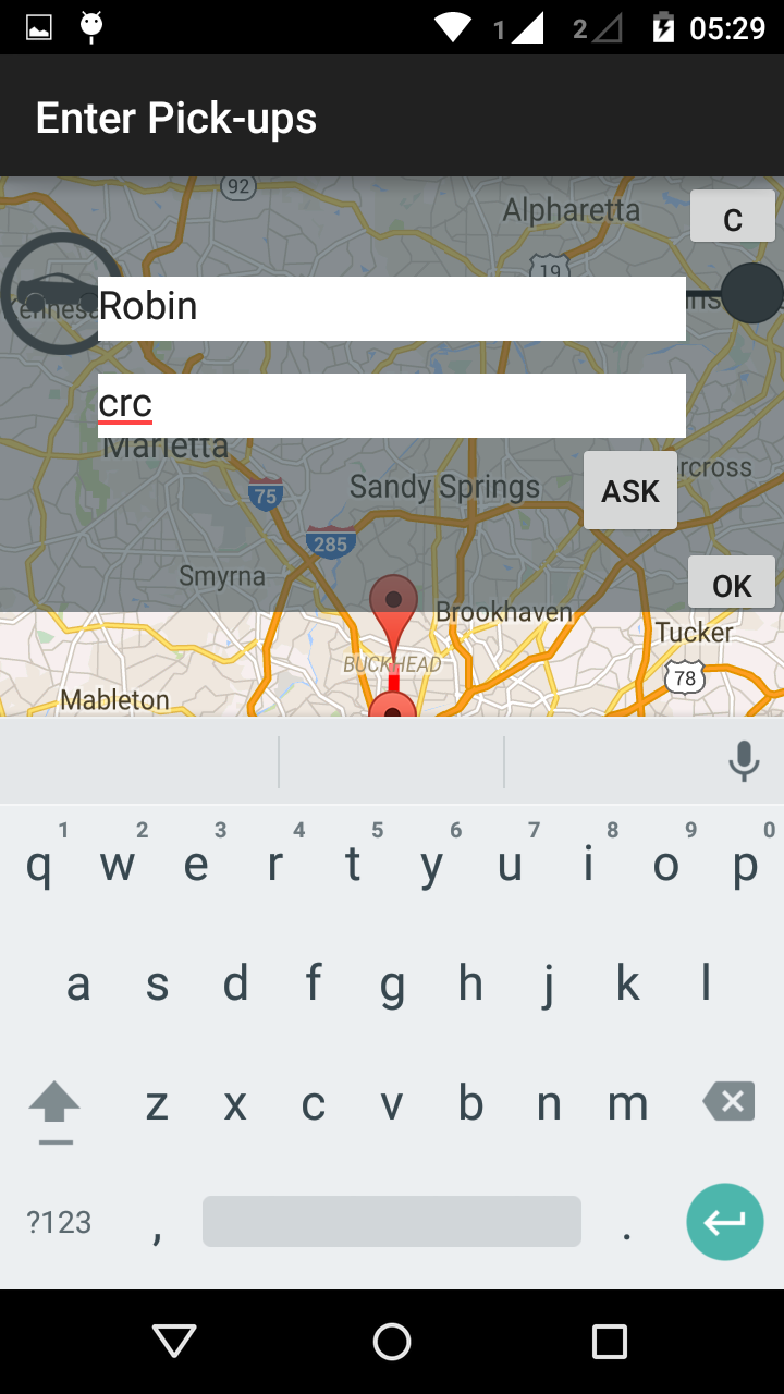
  • Associate names with locations
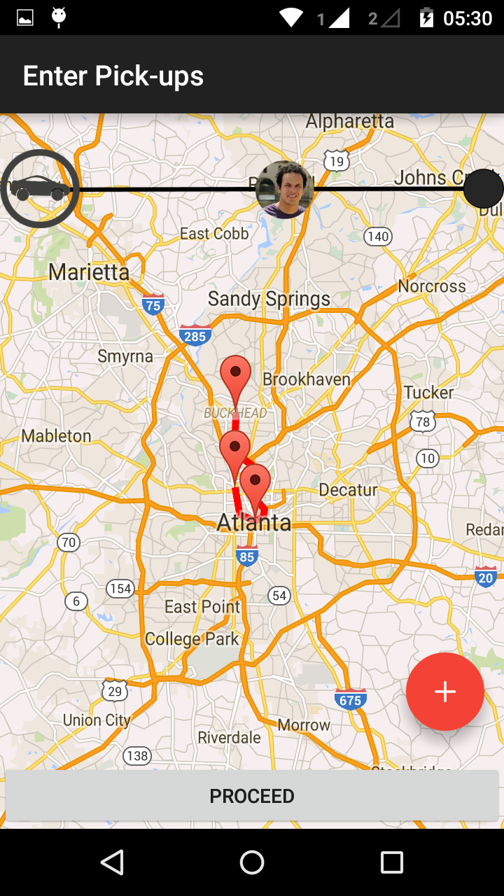
  • Associate pictures with people to be picked up.


Design Decisions

  • It was developed in Android so that the concept can be tested, without having to encounter prototype related biases- it gives complete functionality as proposed and hence the idea can be tested purely on the effectiveness of the concept and will not be judged based on shortcomings of a prototype
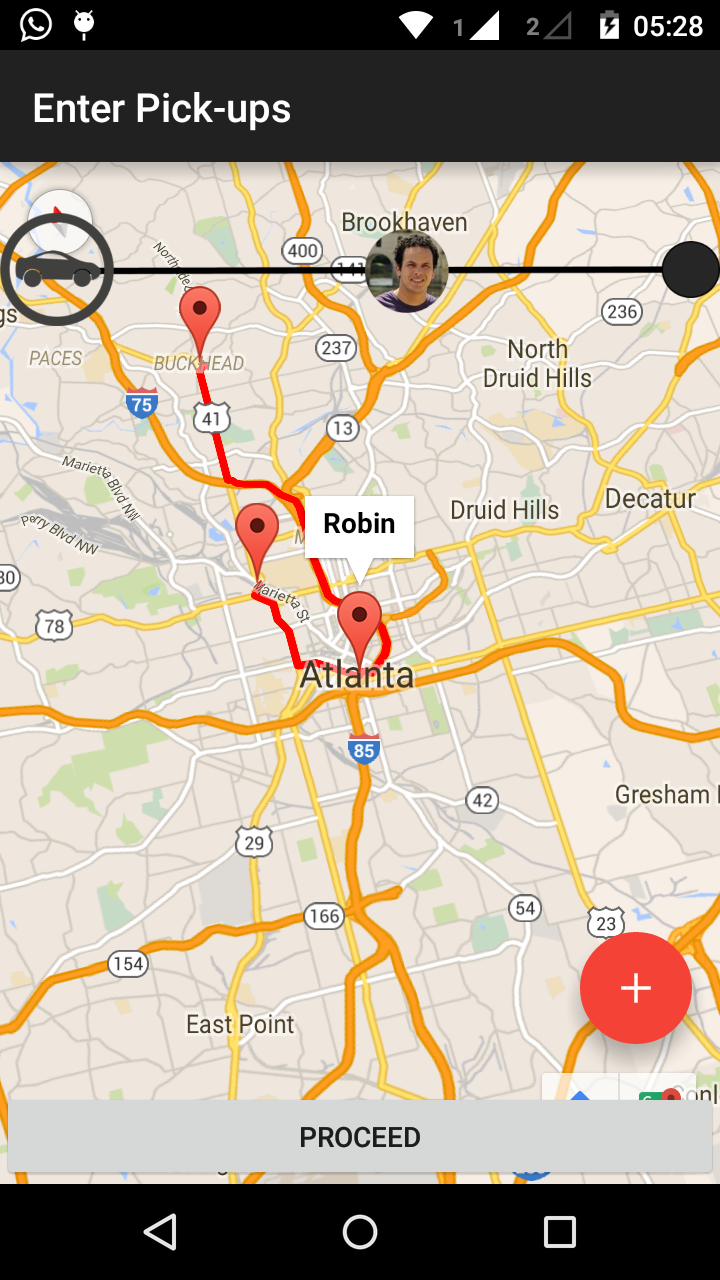
  • A transparent overlay was used on top of the google maps view so that users retain the overall context and the screen area for the map does not get reduced.
  • Floating action button was used to retain familiarity and leverage on popular interface designs
  • A slider on the top has been included at the top of the interface once the pick-up points have been set to give real-time feedback about the car’s position as it starts moving, and to remind the user of the people waiting to be picked-up
  • The slider contains pictures of the people to be picked up. Pictures convey more information than just having a name written there, as visual recognition is known to work much better for people, than name-recalling.
  • The slider is meant to be interactive, such that when there are two or more people represented there, the driver can decide the route, by just dragging and dropping the circular images along the slider.
  • Every map-marker is associated with a name or a destination so that the driver does not have to recall the locations associated with each name.

Usability Criteria

  • Visibility of system status: visibility of status is achieved through suitable screen-titles, suitable text on the buttons, and through the user of a dynamic slider which will give real-time feedback about the position of the car, with respect to the overall distance to be covered.
  • Match between system and the real world: The app uses colloquial language that is easily understandable by all, and makes use of popular UI elements like a red circular floating action button.
  • User control and freedom: User has ultimate say about the route directions. Even though the system suggests the shortest path, the user can manipulate the way-points by just dragging along the slider.
  • Consistency and standards: Consistency is maintained in terms of layouts, button designs, and map representations
  • Error prevention: If the user forgets the address of the person to be picked up, there is the option of asking the concerned person directly, by using the “ask” button. The ask button( functionality has not been implemented in the current prototype) sends a direct request to the person allowing him/her to fill in his/her address. This prevents the possibility of a very serious error in terms of entering the wrong location. Entering a wrong location can mean long waiting times and long detours.
  • Recognition rather than recall: By associating pictures and names along with locations, the app makes sure that the driver does not have to stress about remembering the correct locations/persons to contact.
  • Flexibility and efficiency of use: Users can change the route the way they want to by dragging on the map. They do not have to fidget with the phones while driving, as the app takes care of handling the different detours. Users also have the choice to set any number of pick-up points, including zero.

Conclusion

The app pick and drop is currently at a stage where the functionality of entering pick-up points can be tested with real users. This can be a good pilot study to evaluate the concept on a whole. Several new interaction techniques are in the pipeline waiting to be implemented- the future is exciting.

Other Projects

Portfolio

Portfolio

additional projects